Tuesday, March 29, 2011

Chinoiserie Chic: Decorating With Chinese Antiques

Kitchen of Barcelona-based Interior Designer Lazaro Rosa-Violan. Photo courtesy of Paloma81
By now you all know how much I love the new mish-mash of styles -- High/Low, Rough/Luxe, Antique/Modern, Industrial/Provincial. Decorating your house in one solid style throughout is as dated as a beehive hairdo! Regardless of how stunning an antique or a particular piece might be, it tends to lose its impact in a sea of sameness. How can you shake up your one-note interior? Mix in pieces of varying geographical areas, time periods, styles, and textures.

According to a recent article in the London Telegraph, Chinese antiques have emerged as the biggest auction market in the world. The Chinese screens, low tables, vases, and carved jade pieces that were once nabbed at a bargain are now fetching record high auction prices. And in the world of interior design, Chinoiserie, long thought of as one of the sea-of-sameness styles that smothers (we've all seen the interiors decorated in nothing but chinoiserie), now looks fresh and to-the-minute when added judiciously and thoughtfully in design.

Chinese ancestor portraits have been hot for a couple of years now, and their popularity doesn't show any signs of slowing down. The photo below, from House Beautiful, shows a Michael S. Smith-designed room with paired ancestor paintings on either side of the center window. These paintings hold their own in a room alive with colors and patterns.


Chinese ancestor portraits, known for their larger sizes, bright coloring, and arresting folk-art images, give an unassuming energy to a room that would otherwise have gone stale with traditional European oil portraits.

Courtesy of Bellingham lifestyle blog
I particularly like this multi-generational ancestral portrait from the early 19th Century. It has a great graphic quality to it, almost modern. Though no size is listed for this painting, which hangs in the Peabody Essex Museum, the multi-generational portraits are usually larger than the single-person ancestral portraits, which themselves are usually around four to five feet tall.


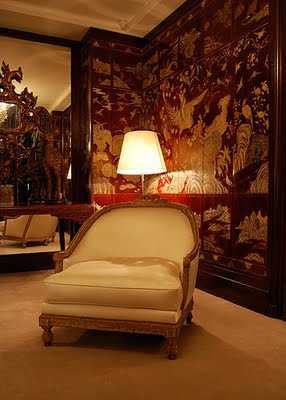
Coromandel screens were made in China and appeared in Europe since the 17th century. They received their name from the Coromandel Coast of India, where they were trans-shipped from China to Europe by merchants of the English and French East India companies. Coco Chanel was taken by the Coromandel screen, seeing them for the first time in a Chinese shop. She had said that the Coromandel screen was the first thing that she bought. She so loved the screens that she populated her Paris apartment with 32 of them.

Coco Chanel's Paris apartment. One of her 32 screens
Again, in Chanel's apartment. She used the screens as room dividers, doors, standing behind sofas, around seating areas, and in place of wallpaper (below).


I really appreciate Charlotte Moss' design below. The Coromandel screen could overwhelm a space if placed improperly. Here, it is appropriate for the space in terms of size, color, and texture. The touch of Chinoiserie fits in perfectly in the new, modern mish-mash of styles.

Designed by Charlotte Moss

Here's a different view of the Asian screen in this blog's opening image. Again, this fabulous kitchen from Barcelona-based designer Lazaro Rosa Violan.   
 

Another design from Rosa-Violan. Here he uses a red Chinese cabinet above the bar area. The red is soft enough that it doesn't overwhelm the bright white interior. Gorgeous!


Below, Rosa-Violan's antique Chinese red table blends perfectly in this clean, modern space.


For years, reproduction Chinese low tables have been used in many a decor for coffee tables. Now, antique Chinese daybeds are a more updated alternative for use in living rooms.

Image courtesy of The Designer's Collaborative blog

 Another Chinese daybed as a coffee table.


Antique Chinese trunk at the foot of the bed. 

Courtesy of Traditional Home


Friday, March 18, 2011

Renovated Farmhouse

Bucks County, Pennsylvania

Earlier this week I wrote about a superb barn renovation in Bucks County, Pennsylvania, that was featured in the June 2010 issue of Architectural Digest. The barn, designed by Penny Drue Baird, is located on a larger property with a farmhouse that had previously been renovated by Ms. Baird. While researching this barn conversion, I found myself wishing that Architectural Digest had shown at least one picture of the farmhouse on the property, which I knew had to be just as fabulous as the barn. After doing a little digging, I think I may have found it. Architectural Digest  ran an article from February 2007 featuring a circa 1810 farmhouse in Bucks County, Pennsylvania, designed by -- you guessed it -- Penny Drue Baird.

Renovated barn on farmhouse property
Though neither article links these two renovations as being on the same property, they are both in Bucks County, both designed by the same person, and the barn article mentions a farmhouse that was previously renovated by the same designer. Are they on the same property? Who cares! Let's see some before and after photos!

Below is the living room, which, by all appearances, looks like it has great bones. But in the Architectural Digest article, the Ms. Baird described as a "designer’s nightmare. It’s a large room with doors on opposite sides, small windows on two sides, a dark, low ceiling and an off-center fireplace."


Below is the 'after' photo. What a gorgeous room! The designer created two separate seating areas, centered by a two-sided setee. I just love the blue Mora clock in this room, and in this precise spot. The blue in the clock is subtly echoed in the blue English pottery collection and the ceramic elephant side table. Just the right amount of blue color to pull the room together without looking matchy-matchy.


The dining room, a later addition to the house, 'before.' At least the room has great floors, good natural light, and good proportions.


Wow! The addition of vintage hand-cut beams and brick facade makes this dining room look like it's been part of the house all along. The antique French wrought-iron chandelier and antique 19th century copper fountain are from a Paris flea market.


Below is the family room which, like the dining room, is a later addition to the farmhouse. You just know those metal sliding doors can't stay!


And this is why people hire interior designers. This room is simply stunning! The sliding doors, along with the windows, were indeed replaced and updated. Room additions include a limestone fireplace, reclaimed-wood panelled walls and ceiling, reclaimed wood beams, and French terra cotta floor tiles. The antique wrought iron chandelier is from Paris. That chaise longue is stunning!


The owner's suite bedroom 'before.'


Rustic elegance! I just love the look of the ceiling beams coupled with the French chandelier. The larger, freestanding upholstered headboard nestling the bed frame, the circa 1880 painted screens, and the simple-yet-sumptuous window treatment make for a cozy and sophisticated space. The larger headboard fabric is from Schumacher. The smaller headboard fabric and pinstripe is from Nobilis.


A farmhouse-elegant bedroom.


The rear of the property.


Tuesday, March 15, 2011

Barn to House Conversion

 Bucks County, Pennsylvania
 
I love my shelter magazines: Veranda, Elle Decor, Traditional Home, Architectural Digest, The English Home. If they don't come to me in the mail, I come to them in the bookstore. Contained in these glossies is a wellspring of artistic inspiration, trend alerts, and sourcing information. And in an effort to stay organized and streamlined, I usually read, absorb the material, then toss/recycle/give away. Sometimes I might clip out an inspirational picture. On rarer occasions I save the entire article. The June, 2010 issue of Architectural Digest featured a much talked-about barn renovation in Bucks County, Pennsylvania, that I clipped and saved.


Several reason this article stayed with me (both literally and figuratively): The gorgeous and eclectic collection of Continental and American furnishings; the beautiful contrast of rustic and luxe; the thoughtful sense of history and preservation; how light and airy the barn-house is, even though the interior is merely milk-painted near its original wood color. On paper, one would think this house would be dark and heavy. But with a large central chandelier, smart placement of recessed and ambient lighting, limestone flooring, front and rear french doors with transoms that reach the ceiling, and furnishings and decor in light, creamy colors, the interior is light and airy. Notice in the photo below how the light limestone coloring of the fireplace mantel and overmantel brighten the Geat Room.


Designers Penny Drue Baird and Irwin Weiner sourced many of the barn's furnishings and decor in France, such as the chandeliers, a 19th century low table with its original tapestry (in picture above), sconces, and lamps. And speaking of lamps, I like that the barley twist lamps are painted a lighter color. They would have disappeared in this space were they in their original wood tone.


Above, a bedroom under the eave. Again, the light, creamy colors of the bed linens and the area rug give lightness this potentially dark space. The old original door looks great in this space, echoing the light colors of the linens. The decorative iron tables (now cushioned for seating) at the end of the bed elevate the design of the room, and keeps it from a one-note rustic look. Of course, the Hermès Avalon blankets have a tendency to enhance any interior. I think those cashmere wonders could make even a gardening shed look like a showroom!


Below, a different bedroom. Again, rustic, with luxurious touches.


Below, you can see the how the limestone brightens the space. The stone tiles are tumbled and in varying sizes, transmitting a feeling of history and age that's appropriate with a 200-year old barn. The dressed-up mahogany billiards table adds a nice luxe juxtaposition to this otherwise rustic corner.


Though it's hard to tell from the exterior photos of the barn, the interior living space is 4,000 square feet over two-and-a-half floors. And this isn't even the main house. This barn is actually the guest residence of the main farmhouse, also renovated by Penny Drue Baird. The barn's renovation was almost a total reconstruction, sheathing the exterior in new wood, and in the interior installing wiring, plumbing, heating and air. After seeing this guesthouse, I would love to see the main farmhouse residence. Kudos!

Friday, March 11, 2011

Gerard Butler's Old-World Style Manhattan Loft

Old-World in New York

In May, 2010, just when as were admiring how well our deconstruct-to-the-structure-and-burlap armchair looked next to our industrial shelving (which does look fabulous, by the way), Architectural Digest profiled Gerard Butler's Chelsea loft in May, 2010, causing the interior design world to sit up in our Belgian linen-covered bergères and take notice. Designed by movie set designer Elvis Restaino, this 3,300 square-foot, two-story loft seems to incorporate just about every design style (save Contemporary Zen), with spectacular results! When asked to describe the loft's style, Butler offered, "I guess I would describe the apartment as Bohemian old-world rustic château with a taste of baroque."


Located on the sixth and seventh floor of an abandoned warehouse, the loft was mostly white and uninspiring, broken up into several small rooms. Butler, however, saw the tall ceilings with oversized arched windows, and realized its potential. His architect, Alexander Gorlin, gutted the apartment for a fresh start, leaving only two support beams. With his hiring of set designer Restaino, Butler found a kindred design soul, and the two developed the loft's "fanciful aesthestic" over four-years' time.


Below is the entryway. The mahogany double doors were salvaged from a Brooklyn brownstone. The coin wall ornament, to the right of the window, was removed from a demolition in Ohio. The plaster surrounding the walls were colored and textured to highlight the coin. The ceiling mural was painted on squares of 1940s movie poster paper, covered in plexiglass, then affixed with decorative buttons. The archway and columns were made from chicken wire and colored plaster, which were color matched with real limestone sculpted lions installed in the arch.
·        

Says Restaino, "You can't compare paint with colored plaster. There is so much more texture and depth to colored plaster. It gives the wall life."
·        
Another view of the entryway during the design phase.

The theatre room. The columns are from India; the wooden arch support was salvaged from a cathedral in the Bronx; the stone lion's head came from an old library. The sofa and ottoman are from ABC Carpet & Home. The previously-white ceiling beams were repainted an aged, wood-grain brown, a much more cost-effective process than chemically-removing or sandblasting paint.


The kitchen cabinets and backsplash were fashioned from leftover reclaimed flooring material.


A closer view of the backsplash and the sink. Love that Celtic motif on the sink apron! The backsplash looks to be made from colored and textured plaster-covered tiles and wood pieces.


Both elegant and rustic -- three mismatched crystal chandeliers suspended over a medieval-style dining table.


Butler's bedroom.


Butler, who maintains two other homes, a Spanish-style house in the Hollywood Hills and a flat in London, has plans to renovate the loft's second floor and adjoining rooftop terrace. "Whenever I open that huge door, I just think how lucky I am," he says. "Those walls that surround you in the entrance hall and the huge chandelier right in front of you and this beautiful fresco above you -- you realize you're somewhere that's completely original."


Sunday, March 6, 2011

Ralph Lauren's Flagship Store in St. Germain, Paris

 
Where Fashion and Interior Design Meet
In April of 2010, Ralph Lauren opened his Paris flagship store on Boulevard Saint Germain. The six-story, 23,000 square-foot store, built in 1754 on the foundations of a monastery, had in the past housed the Dutch Embassy, the Carnegie Foundation, as well as spent time as a government building. And though the building had seen better days and centuries, Lauren fell in love with the diamond-in-the-rough. He acquired the building in 2007, and spent the next 2 years renovating and restoring limestone flooring, oak paneling, and Versailles parquet. "With this store opening, in the most romantic part of the city, I finally feel that I have been able to tell my whole story in Paris."

Talk about a dramatic entrance! The limestone staircase in the entry has been restored to its original glory.


One of the many clothing galleries.

The Watch Boutique. Formerly the guardian's loge, the room's polished oak paneling against the white plaster, and the sparkling crystal chandelier add a certain grand stateliness to the small room. Note the original restored Versailles-style parquet flooring.

Watch Boutique

How gorgeous is this room?? That gauze covered chandelier is a showstopper on its own! The greige (grey-beige) color is up-to-date modern yet old world, perfect for the Ralph Lauren Home Collection. Here you can see the restored original plaster mouldings.


The men's dressing area is handsome and spare, allowing the burnished brown leather and Versailles parquet floor to set the tone.


The Ralph Lauren flagships stores are getting looks for their interior design and displayed artwork, such as this mint-condition framed vintage flag. Not only does the flag showcase Lauren's home country, but also makes a colorful design impact.


With the stunning limestone fireplace, brick walls and beamed ceilings, the interior restaurant -- formerly horse stables -- exemplifies old-world Europe (with Ralph Lauren's touches of Americana, of course).


This closer view of the restaurant is almost a vignette of classic Ralph Lauren: the equestrian artwork; the plaid and leopard print fabric; the burnished-brown leather; polished oak paneling.


Once the carriage house, the courtyard restaurant is open during warmer months. Before acquiring the building, Ralph Lauren saw the the old carriage-house courtyard, complete with old stables in the back and cobblestone on the ground, he immediately thought of putting a restaurant there. The bar is located where the old tack room used to be.


Another view of the courtyard restaurant.